


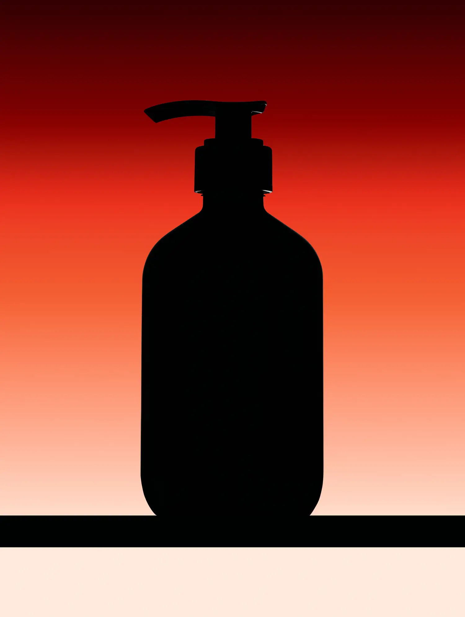

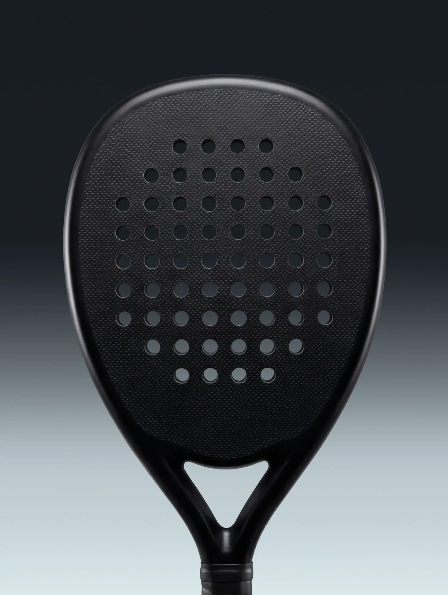

Colour Begins as Atmosphere
Start with an image.
Atmos turns its atmosphere into a palette.
Atmos draws five colours from an image and shows how much of it each one covers. It describes each colour by its lightness, chroma and hue, measures the contrast of all ten pairs, and suggests roles such as background, text and accent.
The sections below explain each step and how to read the results.
From an Image You Like to a Starting Palette
A project often starts with an image whose colours feel right. Picking them out by eye is slow, because each area holds many shades. Colours that look good together can also lack the contrast text needs.
Atmos does that first step for you and measures the result. You still choose which colours to use, and adjust them in your own design tools.
A palette is more useful when you can understand the relationships within it.
Atmos brings colour properties, proportions and contrast together, helping you explore how the colours could work while keeping the original image in view.
How Atmos Reads Colour
Atmos uses two complementary ways of reading colour. OKLCH describes the character of each colour. WCAG measures whether two colours create enough contrast for a particular purpose.
Neither provides the full answer alone. A palette can feel coherent and still contain pairings that are difficult to read. A pair can meet a contrast requirement and still feel disconnected from the atmosphere around it.
Atmos uses both.
OKLCH
- Lightness
- 0.616
- Chroma
- 0.141
- Hue
- 128°
Describes what a colour is. It belongs to one colour on its own.
WCAG contrast
6.09 to 1
Describes what a pair can do. It has no meaning until a second colour is named.
Reading OKLCH
Every sampled colour is described through lightness, chroma and hue. Together they reveal the shape of a colour. They do not determine whether it is accessible.
Lightness
0.00.20.40.60.81.0
How light or dark a colour appears, on a scale from 0 to 1. Zero is black. One is white. This is perceptual lightness, which helps designers make changes that feel visually consistent. It is not the same measurement as the relative luminance used by WCAG.
Chroma
0.000.040.080.120.160.20
How strongly a colour departs from neutral. At zero the colour is grey. As chroma rises the colour becomes more vivid. A chroma value only makes sense as part of the complete colour, because its visible effect depends on lightness, hue and the available gamut.
Hue
0°30°60°90°120°150°180°210°240°270°300°330°
The colour’s position around a perceptual colour wheel, measured as an angle from 0° to 360°. As chroma approaches zero, hue carries less visible meaning. A nearly neutral grey can still have a recorded hue, but that hue contributes very little to what the eye sees.
Reading WCAG Contrast
Contrast belongs to a pair, not to an individual colour. WCAG compares the relative luminance of a foreground colour and the colour behind it. The result sits between 1 to 1 and 21 to 1. A ratio of 1 to 1 means there is no luminance contrast. A ratio of 21 to 1 is the maximum contrast between black and white.
A result below 3 to 1 does not make the colours unusable. The pair can still create atmosphere, depth and decorative separation. It should not be responsible for legibility, interaction or essential visual information.
A pair does not simply pass WCAG. It passes for body text, for large text or for a meaningful non-text element.
- Body text4.5 to 1 or higher
- Large text3 to 1 or higher
- Meaningful graphics and interface elements3 to 1 or higher against adjacent colours
An Image Is More Than Its Most Common Colours
Conventional colour extraction often begins with frequency. It identifies the colours that occupy the largest areas of an image and ranks them by prevalence.
But prevalence is not the same as importance. A small highlight can define an image’s energy. A near-black shadow can create its depth. A muted field can make a single saturated detail feel vivid.
Atmos considers how much of each colour is present, how the colours relate and what each one contributes to the image as a whole.
- #EAE8DDL .93 · C .015 · H 98°77.7%
- #B8CD79L .81 · C .111 · H 120°8.1%
- #6C9429L .62 · C .141 · H 128°5.6%
- #3C5E19L .44 · C .104 · H 132°4.8%
- #1B2F0CL .28 · C .063 · H 134°3.8%
Reading the Shape of a Palette
Two colours can share a hue and still perform entirely different roles. A change in lightness can separate one surface from another. It can also determine whether text can be read at all.
A change in chroma can turn a quiet detail into a focal point without changing its underlying hue.
Atmos reads all three dimensions together. Each is taken on its own below, in the palette whose character turns on it.
From Sampled Colours to Suggested Roles
A palette describes the colours drawn from an image. Suggested roles offer possible ways to use those colours in a design.
Atmos suggests background, surface, text, primary, secondary and accent roles. These are a starting point for exploration, not a finished design or a guarantee that every pairing meets a contrast requirement.
Review the roles in the context of your work. Check contrast between the colours you use together, and adjust them in your own tools where needed.
Background
#000000
20.8% of the frame
Surface
#090606
9.0% of the frame
Primary
#383B49
1.6% of the frame
Secondary
#383B49
shares the primary swatch
Accent
#6881AE
34.9% of the frame
Text
#8CA6D5
33.6% of the frame
Frozen Slate shows how five colours can be assigned to six suggested roles. At least one colour must be used more than once. Where roles share a colour, use placement, shape or text to make their purpose clear.

Contrast Creates Hierarchy
Contrast helps you decide which colour pairs can carry text or essential visual information, and which are better suited to decorative use.
Small differences between colours can create subtle depth. Text and essential controls need sufficient contrast against their backgrounds. Check each pairing for its intended use.
- 10.26 to 1Body text at AA
- 4.92 to 1Body text at AA
- 4.70 to 1Body text at AA
- 3.63 to 1Large text and UI at AA
- 2.82 to 1No WCAG contrast role
- 2.25 to 1No WCAG contrast role
- 2.18 to 1No WCAG contrast role
- 2.08 to 1No WCAG contrast role
- 1.74 to 1No WCAG contrast role
- 1.29 to 1No WCAG contrast role
Some Images Already Contain the Required Relationships
Cool blue-greys sit at similar visual temperatures, while one clearer blue carries the palette’s strongest chromatic note.
Nothing needed to be adjusted for the assigned roles shown here. That does not make every possible use of the palette compliant. It means the selected relationships already meet their intended requirements.

Frozen Slate
Cool blue-greys at one temperature, with a single clearer blue carrying the chromatic note.
PrimaryAccent
- Text on background8.53 to 1Body text at AA
- Text on surface8.20 to 1Body text at AA
- Text on primary4.51 to 1Body text at AA
- Accent against background5.34 to 1Meaningful non-text elements at AA
Five of the palette’s ten pairs reach at least 4.5 to 1. They can support body text at AA when used as foreground and background.
The Intervals Matter
The character of a palette often lives in the distance between its colours. A narrow change in OKLCH lightness can create subtle depth. A wider one can establish hierarchy. Related hues can produce harmony, while a controlled shift in chroma can introduce tension and focus.
Atmos makes these differences visible, helping you compare how closely the colours relate in lightness, chroma and hue.
#0A2944
0.236
Lightness +0.236
Chroma −0.002
Hue 9° #456B85 0.054 Lightness +0.054
Chroma 0.000
Hue 1° #547B95 0.060 Lightness +0.060
Chroma −0.005
Hue 3° #678DA4 0.244 Lightness +0.235
Chroma −0.038
Hue 121° #D0D2C6
Chroma −0.002
Hue 9° #456B85 0.054 Lightness +0.054
Chroma 0.000
Hue 1° #547B95 0.060 Lightness +0.060
Chroma −0.005
Hue 3° #678DA4 0.244 Lightness +0.235
Chroma −0.038
Hue 121° #D0D2C6
From Reading to Use
The palette is a starting point for your work. Explore its relationships and decide which colours to carry into your design.
Use harmonies to explore related colours and the contrast checker to assess specific pairs. Keep related palettes together in Library projects, then copy the values or export them for your design tools. You can include six suggested roles as an optional starting structure.
Make adjustments in your own tools and check contrast again when a pairing changes. Back up your Library to keep a separate copy of your saved palettes.
The examples below are palettes drawn from different photographs. Compare their colours, proportions and contrast, then try your own image in the desktop tool.

Dry Season

Forged Midfield
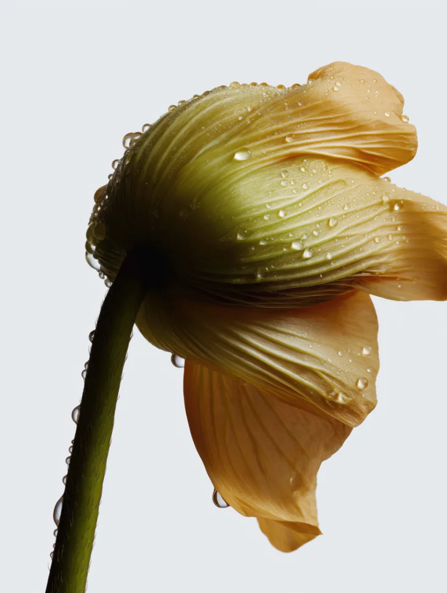
Scorched Clear Morning
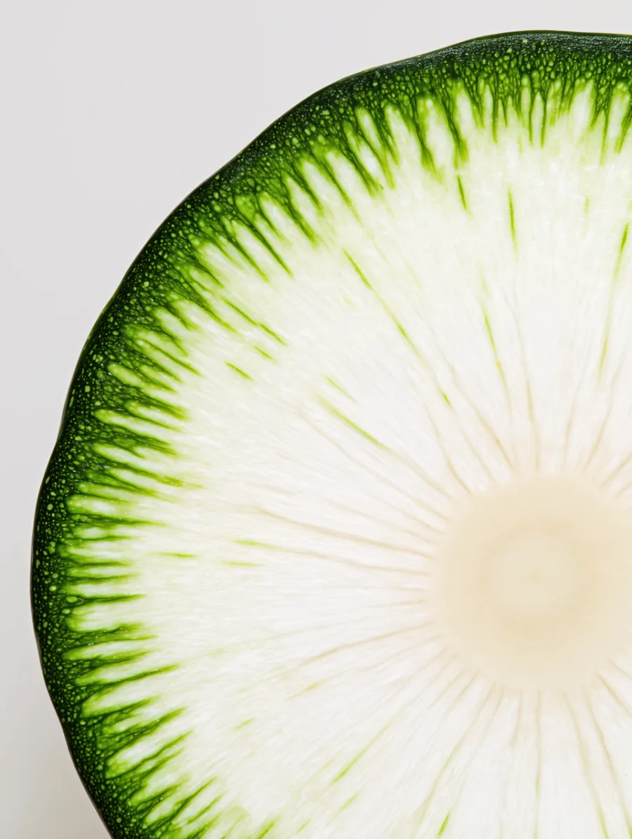
High Key
Frozen Slate

Midfield

Hard Gunmetal
Start with an image.
Discover its palette.